Which of the following best represents the temperature versus heat supplied graph for water, in the range of to ?
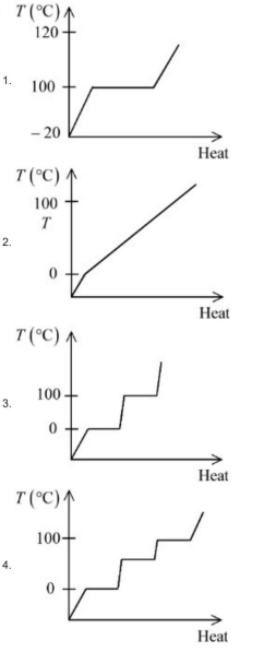
- A
Graph 1
- B
Graph 2
- C
Graph 3
- D
Graph 4
Which of the following best represents the temperature versus heat supplied graph for water, in the range of to ?

Graph 1
Graph 2
Graph 3
Graph 4
Correct answer:D
Standard Method
Given: Water is heated from to .
Find: Which temperature versus heat supplied graph is correct.
Concept: In a temperature–heat graph, horizontal portions indicate phase change. During phase change, heat is absorbed but temperature remains constant.
For water, the important temperatures are:
From to , water is ice, so temperature increases with heat. The graph must have a rising line.
At , ice melts into water. Temperature remains constant while latent heat of fusion is supplied. Therefore, the graph must have a horizontal segment at .
From to , water is liquid, so temperature again rises with heat. The graph must have another rising segment.
At , water boils into steam. Temperature remains constant while latent heat of vaporization is supplied. Therefore, the graph must have a horizontal segment at .
From to , steam is heated further, so temperature rises again.
Thus the correct graph must show:
Among the given options, Graph 4 satisfies all these conditions. Therefore, the correct option is D.
Choosing a graph with only one flat portion is incorrect because water undergoes two phase changes in this range: melting at and boiling at . Always check for both horizontal segments.
Assuming temperature always rises when heat is supplied is wrong. During phase change, heat goes into latent heat, so temperature remains constant. Look for flat portions at the phase-change temperatures.
Ignoring the starting temperature leads to an incorrect graph. The graph must begin below with a rising segment for heating ice before melting starts.
Get unlimited AI-adaptive practice, mastery tracking, and an AI tutor that explains every step — free to start.